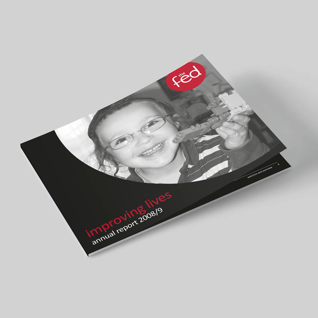
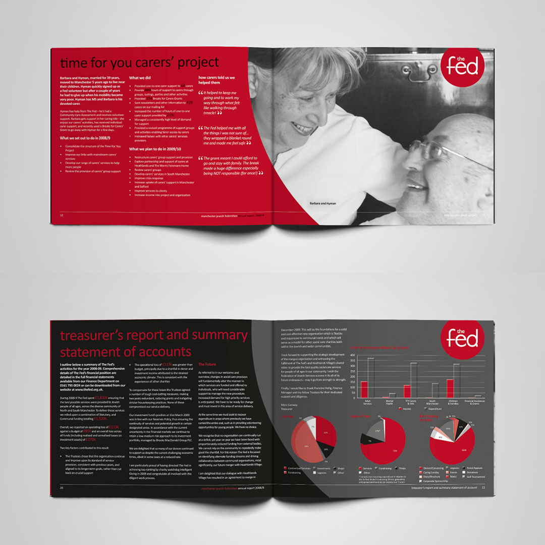
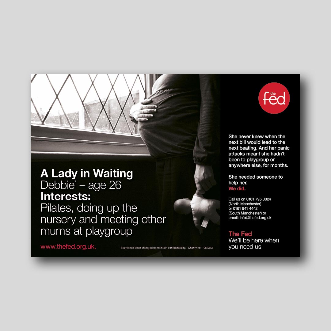
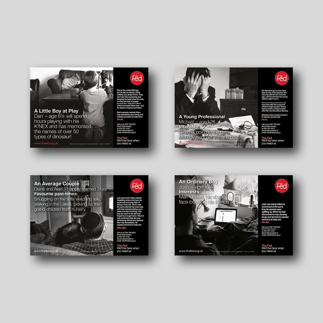


Annual Review and Newspaper Adverts
Client: The Fed
With their annual review, The Fed opted for a two colour print in order to keep costs low. I was tasked with designing the review to look appealing and to convey all of the necessary information using just red, white and black tones.
They also required a series of newspaper adverts using a similar colour palette. Each advert showing the different types of people helped by The Fed.